


By showing the territories from above, the cartographer takes an artificial “objective” point of view. He/she stops being just a “regular inhabitant” who lives in the world to become an observer, as well as a reporter. Just like the photographer or the painter, the map maker turns into a messenger bringing back data “from above” to the people “on the ground”. Its not meaningless, and its certainly never purely objective.
First maps were used more to conquest and distribute resources than for anything else. There is something very powerful about being the one to draw everybody’s land, to trace borders, to delimit people’s possessions. The one looking from above has more visibility. He gets the “big picture” of things. When human beings began to map their world, they start to act like “planet’s managers” and not just as passive creatures.
Humanity shifted then from the scale of immediacy (what you see everyday around you) to the regional & global scale (what you can now conceive above your every day world, even if you haven’t experienced it yourself).
Still today, even at the age of Google Earth & ubiquitous GPS, maps are still heavily connoted. Let’s find out what those hidden meanings are.
- The Projection choice tells more than you think
- Scale matters
- How colours can hide or reveal things
- Legend speaks for itself (or not)
- Theme & Data: reading between the lines
[Also see the article “What are borders”]
1. The Projection choice tells more than you think
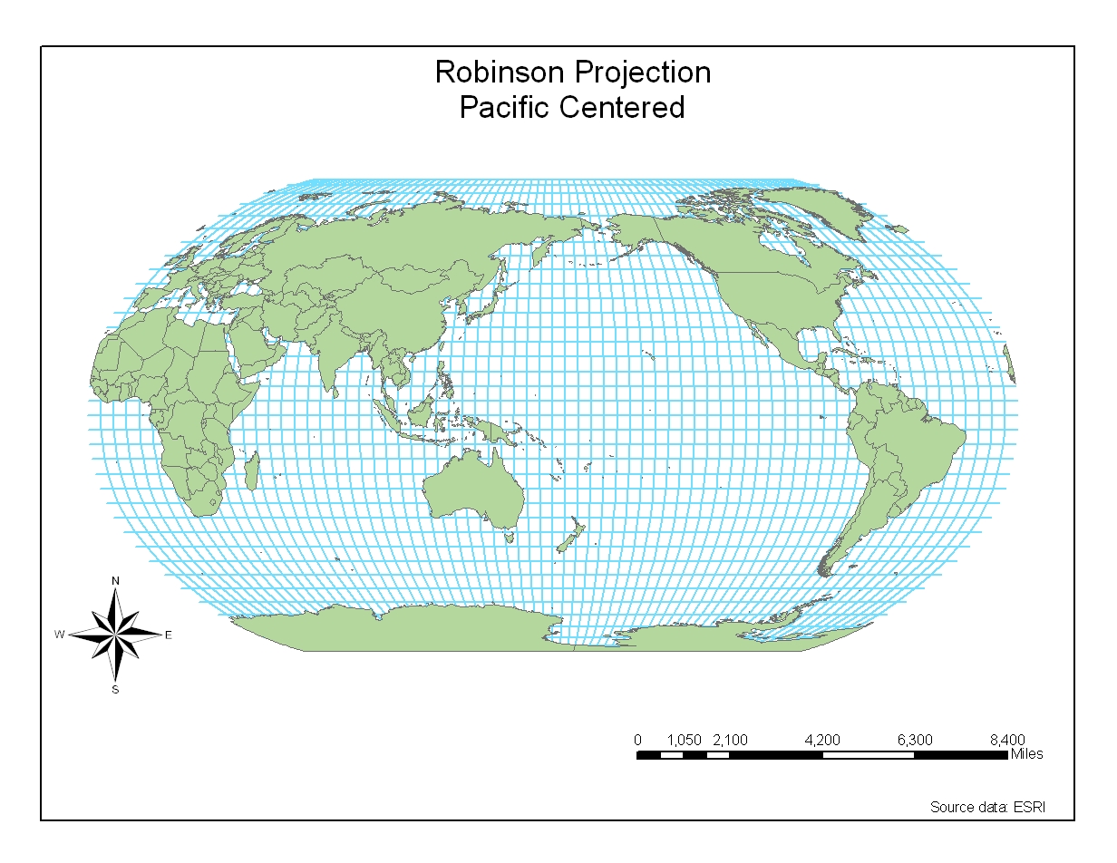
Map projection is basically the canvas. It is the grid shape beneath the map, the angle the cartographer choose to illustrate his point & topic. Projections can modify the way countries and continents will look: the Robinson Projection, for instance, accentuates the natural curve of the earth between tropics. Northern and southern regions appear smaller than the equatorial ones. The example below is Pacific centred, witch puts the focus Asia & the Pacific Region and shows Europe as a outlying region here. At least on this one, New Zealand is not presented as an extremely remote island on the edge of the world, almost cut in half on most usual maps using the Mercator Projection.
This butterfly projection (below) allows to put emphasis on routes and circumnavigation. That’s how the Port of San Francisco choose to show how central they are and how strategic their situation is relatively to other big commercial harbours in the world. Here Asia is cut in half, New Zealand appears very far from Australia and North America appears like the centre of the world.

The more recent cartogram projection technique (below) makes grid size change according to data you put in it. Its a fantastic way to embed a theme in the very outlines of territories. On this example taken from Benjamin Hennig’s blog, size of countries vary according to their croplands surface percentage. On this map, USA & India appear even bigger than they really are, illustrating how “above the average” they relatively are VS other countries of the world, and it looks like Scandinavia or Peru barely exist.

As a last example, here is a map of underwater world topography, America centred to show better big rifts configuration around continents. The projection used here is the classic Mercator one, that stretches northern & southern latitudes countries (North Canada, Greenland and north Scandinavia appear much bigger than they are). Here the cartographer made the choice to loose accuracy at the top & very bottom of the map, where there are no big rift to show, to gain visibility on oceans & Pacific rift.

[Want to give it a try? Use this World Map Generator App]
2. Scale matters
Once you’ve picked up a projection, you have to choose what scale is the best to illustrate the trend or phenomena you want to show. More than a zoom level, picking up the right scale is a tricky & meaningful process similar to building a photograph composition.
The scale choice reveals the very interpretation the cartographer is making of the represented phenomena. People and places that do not appear on the map are considered not relevant to the topic. Then, the edges of the map define a time & space frame containing both the issue & its solution/explanation.
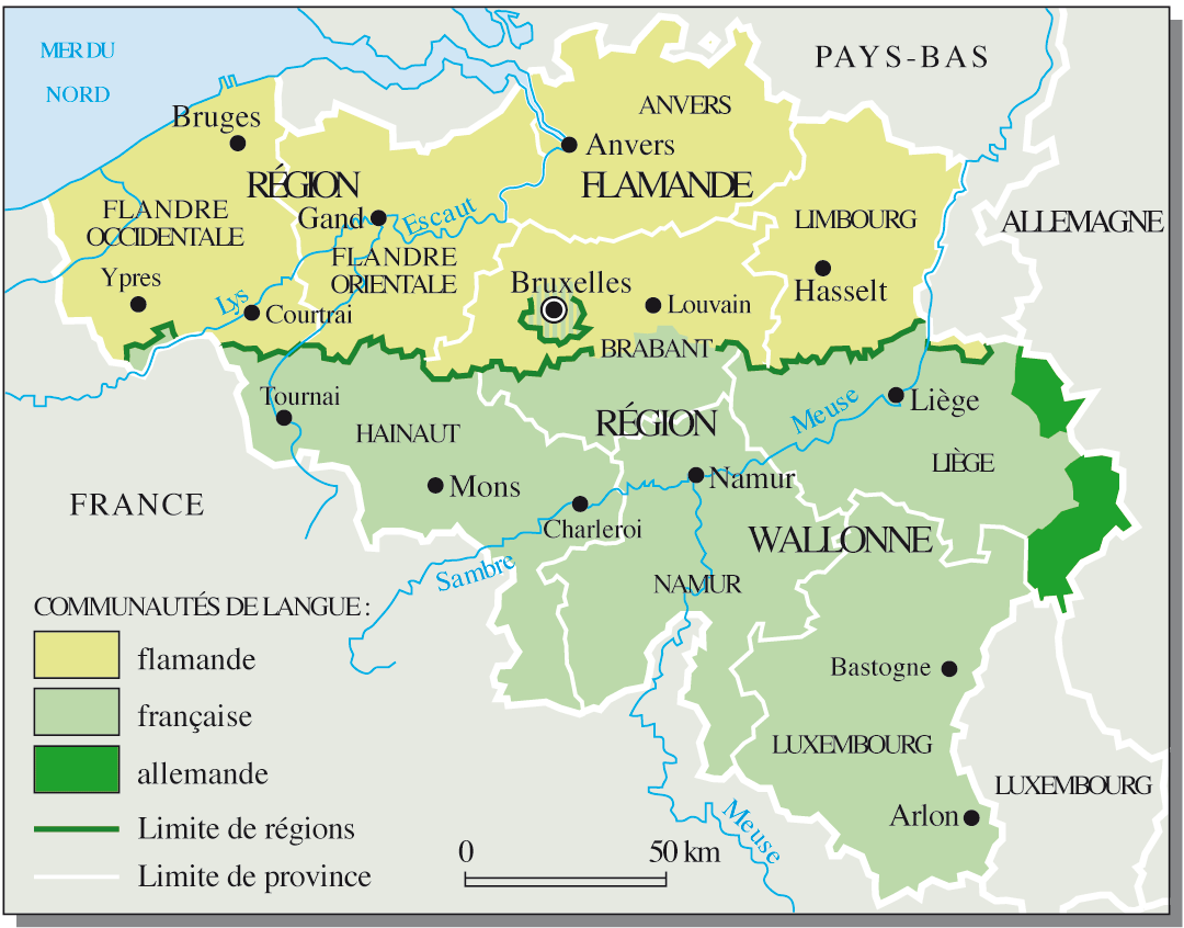
On this map from Le Monde Diplomatique, for instance, the political situation in Belgium is the topic. The map was illustrating an article about the 1993 agreement of Saint Michel that made Belgium a federal state by unifying the two main regions as well as smaller german regions under the same government. This is a very specific debate concerning Belgium and Belgium only, not depending on external forces. The issue (political unity of Belgium) contains its solution (its a national debate that no one else can solve but Belgians).
On the example below, a map illustrating the Falklands War of 1982 between United Kingdom and Argentina over Falklands Islands sovereignty, the playground is the Atlantic Ocean, North to South.

The map focuses on the two protagonists to show how & when they moved strategically to an actual open conflict over the Falklands. There is clearly no other country involved in this, nor other political influences. The map is focusing on strategy, events timeline and show very well the obvious handicap of distance United Kingdom had. That tells us a lot about how UK’s empire last bite was escaping from its yoke and how they desperately fought for it, more as a symbol than as an essential land possession.
Finally, on this last example below, we can observe the Muslim Distribution. I picked that map which is not the most beautiful one to point out how scale matters here. Indeed, the map covers a very wide area from east to west, but a relatively smaller one from north to south. Are origins & history of Islam more about longitudinal migrations than latitudinal ones? Well, it is. The religion spread from middle east to Asia and North Africa, but were pushed away north and south by other forces (Christianity to the north & west, as well as from european colonies in central & southern Africa).

The framing of the map illustrates the geographical influence area of the topic in the world.
To come in The Hidden Meanings of Maps (2/2):
- How colours can hide or reveal things
- Legend speaks for itself (or not)
- Theme & Data: reading between the lines
[Mapping, a Critical Introduction to Cartography & GIS book]
Related articles
- Know : Error with our World Maps! (propelsteps.wordpress.com)
- What four things do map projections distort? (jugraphia.wordpress.com)
- Maps as art: 3 keywords (awbaird2.wordpress.com)
- Creatures of Cartography (streetsofsalem.com)
- I Continue to Learn That Maps and Cartography Are Not Just Plotting a Physical Location… (mcdivittandmaps.wordpress.com)
- Minds behind the Maps – Tony Scavuzzo (conversations.nokia.com)
- Maps tend to come in two varieties: small, schematic, and bewildering; and large, fantastically detailed, and bewildering… Charles C. Mann (oldsaltbooks.wordpress.com)
- Get to Know a Projection: Mercator Response (kennethflora.wordpress.com)
- Maps as political (azumahcarol.wordpress.com)
